Projects About Contact Download CV
← Back to projects
Design Marketing

Brand Logo Design — BioCleanair

A full logo redesign for BioCleanair, an air purification company — modernising their visual identity while staying true to their brand values of health, nature, and clean air.

Year 2025
Type Personal Project
Tools Illustrator · Canva
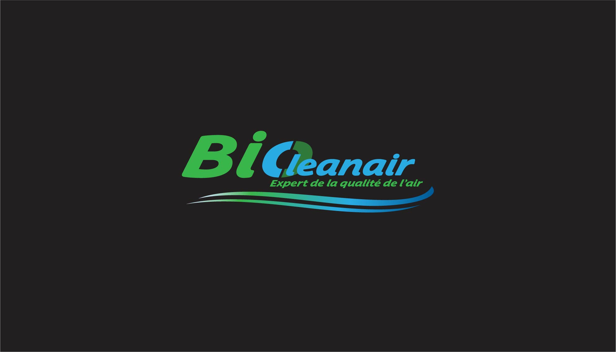
BioCleanair logo design hero visual
01 — Context

The situation

BioCleanair is a company specialising in innovative air purification solutions for both residential and professional environments. Their existing logo felt outdated — it didn't reflect the modern, trustworthy, and eco-conscious positioning the brand was aiming for.

I took on the redesign as a personal initiative, working from a brief I constructed myself based on the company's vision (healthy environments for all) and mission (effective, sustainable air quality solutions). The goal was to produce a visual identity that could work across all media — from digital favicon to large-format signage.

02 — Objective

What needed to be done

  • Highlight the connection between air quality and health in the visual language
  • Modernise the identity to feel contemporary and professional
  • Ensure the logo was legible and adaptable across all formats and sizes
  • Create a symbol that is memorable and clearly reflects the brand's values
03 — Strategy

My approach

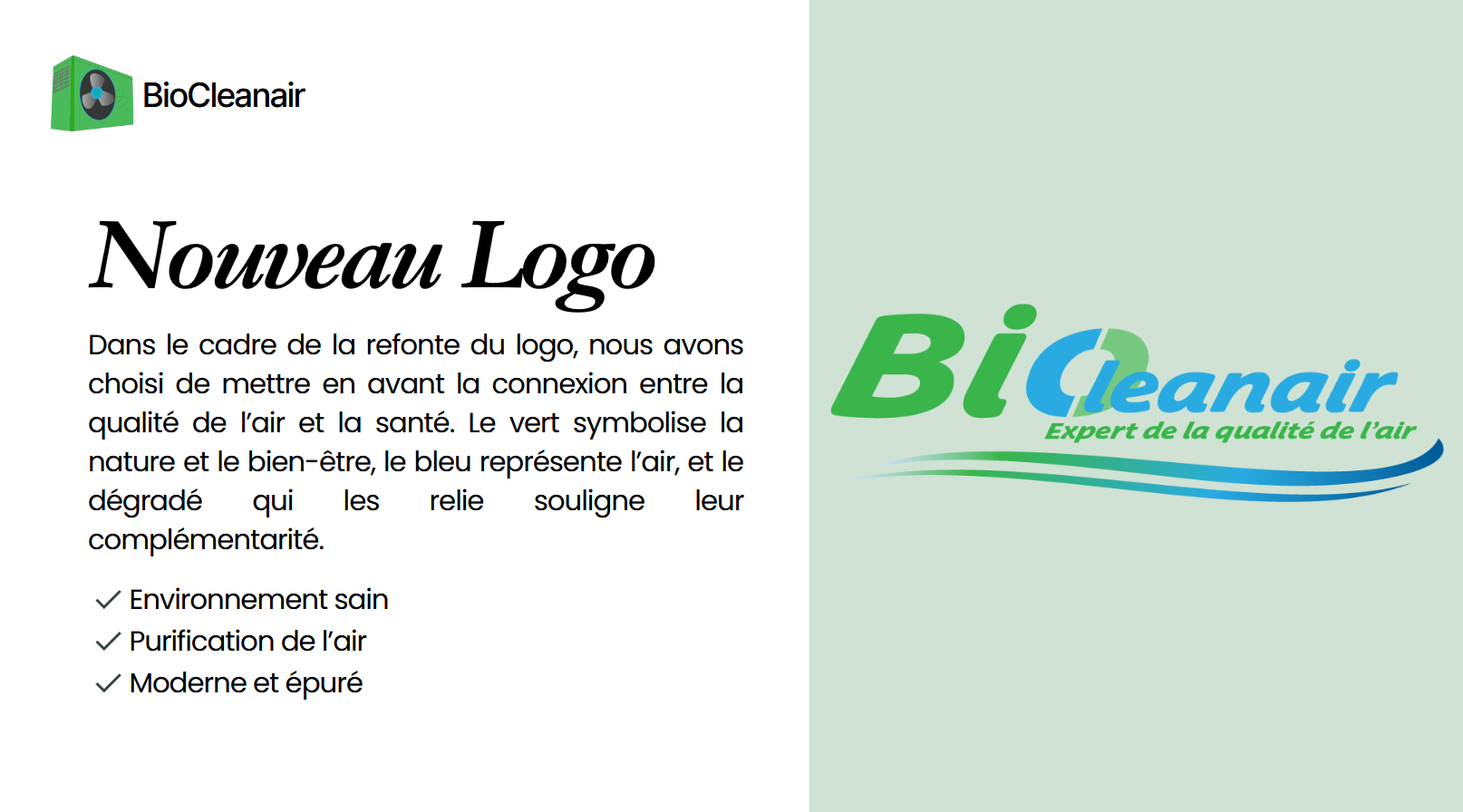
The design direction was built around a colour-driven concept: green for nature and health, blue for air and purity — with a gradient linking the two to visually represent their complementarity. This was more than an aesthetic choice; it embedded the brand's core message directly into the logo itself.

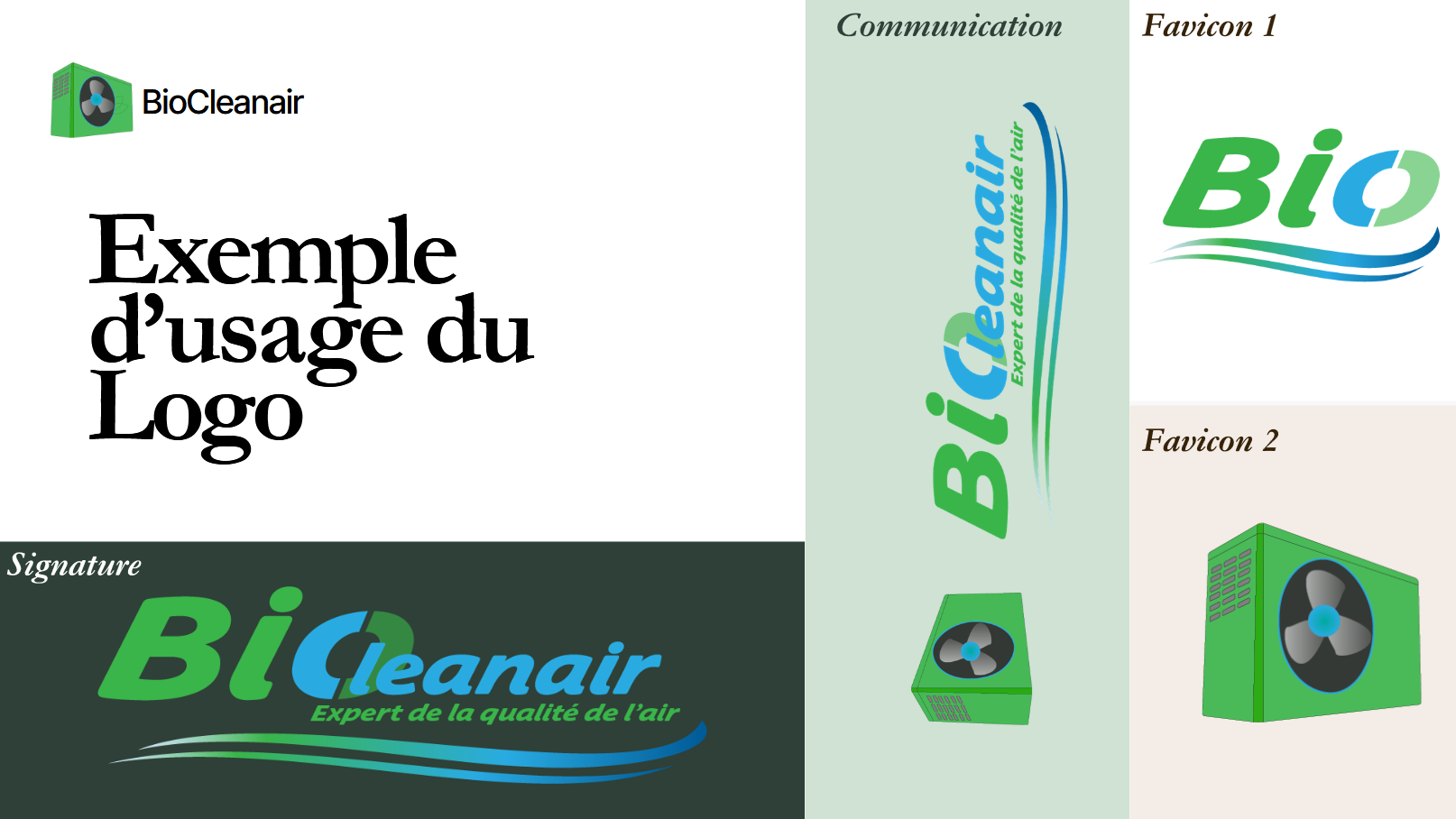
I also decided to design multiple usage variants from the start: a full signature logo, a simplified favicon, and a vertical communication banner format. A single logo that can't adapt isn't a real brand asset — so adaptability was baked into the process rather than treated as an afterthought.

04 — Execution

What I did

  • Defined the brand colour palette: deep blue (#1078B3), sky blue (#29ABE1), green (#3AB64B), and white
  • Selected the Airco STD typeface, a custom-styled font that reinforces the technical yet approachable tone
  • Designed the main wordmark combining green "Bi" and blue "Cleanair" with a swoosh underline suggesting airflow
  • Created two favicon variants: a typographic "Bio" mark and a product-based icon (air purifier unit)
  • Designed a vertical communication banner for event and trade show use
  • Presented all assets in a structured slide deck simulating a brand identity delivery
  • Exported and shared all files via Google Drive for easy client access
05 — Results

Deliverables

A complete brand identity package, ready to deploy across all formats:

1
Full signature logo (horizontal)
2
Favicon variants designed
4
Brand colours defined
3
Usage formats delivered
06 — Visuals

Logo & brand identity materials

Full logo, colour palette, typography specimen, and usage examples from the brand identity deliverable.

07 — Learnings

What I took away

Designing without a brief handed to you forces you to think like a strategist before you think like a designer. Writing my own brief — defining the brand's values, audience, and communication goals — made every design decision feel grounded rather than arbitrary.

I also discovered how much a logo lives or dies in its smallest form. Testing each variant at favicon size early in the process saved a lot of rework and pushed me toward cleaner, bolder shapes from the start. Constraints are a feature, not a bug.

← Back to projects Next project →